Create consistency
Build a recognizable visual direction that could support Mia’s public-facing work and make every book-tour interaction feel connected.
REAL CLIENTS. THOUGHTFUL WORK.
Hear directly from the people we work with, then look behind the finished products to see the thinking, collaboration and care that brought each project to life.
Shop Products ↗MIA HALL
Renowned author, producer and media personality
Mia Hall came to Upright Promo for more than a few promotional pieces. She needed a clear, connected brand presence that could support her work and show up confidently throughout her book tour.
We worked collaboratively to shape her brand direction, select a purposeful color palette and carry that visual identity across every touchpoint. The finished campaign included custom bookmarks for readers and a branded banner designed to give her tour appearances a polished, consistent backdrop.
View the Case Study ↓CASE STUDY 01
Build a recognizable visual direction that could support Mia’s public-facing work and make every book-tour interaction feel connected.
Develop the overall brand strategy and choose colors that reflected Mia’s voice while remaining flexible across print, display and promotional applications.
Translate the approved direction into custom bookmarks for tour guests and a branded banner that created a strong, professional presence at appearances.
THE RESULT
A coordinated set of brand materials that made Mia’s message more memorable and gave her a consistent way to show up at each stop—not disconnected products, but a campaign designed around the experience.
CASE STUDY 02 · FLEET BRANDING
A straightforward license plate became a practical way to help Coca-Cola’s local bottling operation identify fleet vehicles and reinforce one of the world’s most recognizable brands wherever those vehicles traveled.
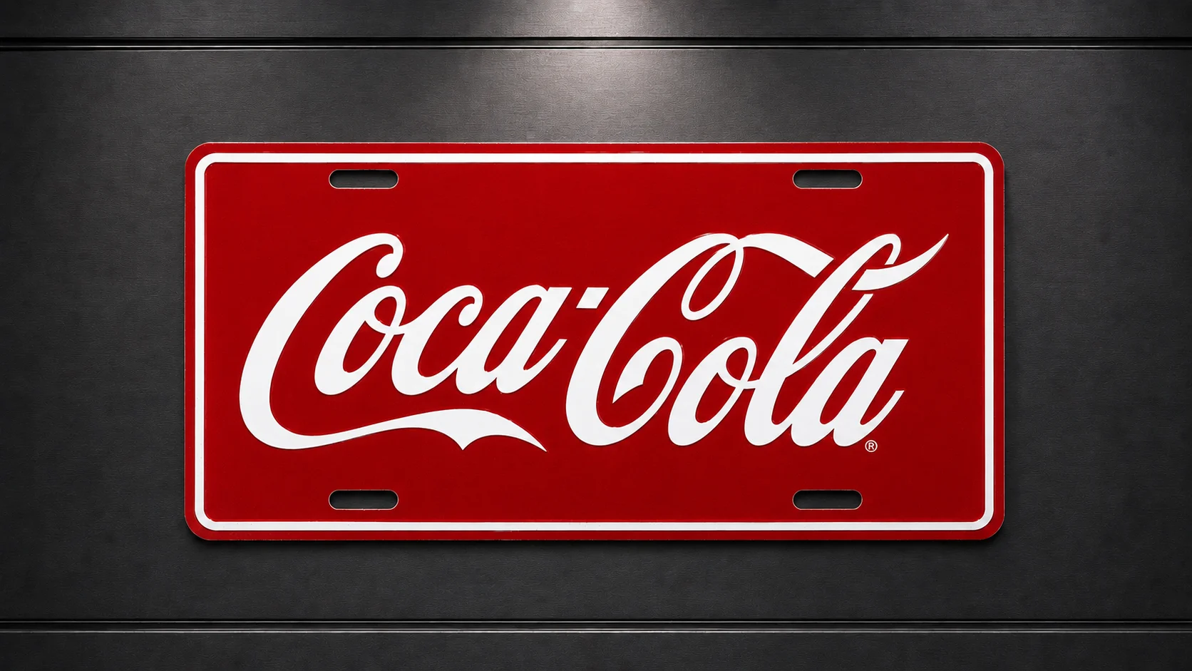
A manager within Coca-Cola’s bottling division wanted a simple, visible way to identify the trucks leaving the facility each day. The vehicles were already part of the company’s daily presence in the community, but the manager saw an opportunity to make their appearance more consistent and reinforce Coca-Cola branding across the fleet.
The solution did not need to be complicated. It needed to be recognizable at a glance, appropriate for daily vehicle use and visually connected to the brand people already knew.
Upright Promo focused the design on Coca-Cola’s strongest visual assets: its unmistakable red field, high-contrast white script and classic presentation. Rather than adding unnecessary copy or decorative elements, the plate used a restrained layout that made the identity immediate and readable.
The embossed aluminum format gave the piece the structure and durability expected of a vehicle plate, while the mounting slots made installation straightforward. Every detail supported one goal—turning a small area on each vehicle into a clean, consistent brand touchpoint.
After the concept was approved, the custom plates were produced and installed across several vehicles in the bottling division’s fleet. Because the design stayed faithful to established Coca-Cola colors and proportions, it felt like a natural extension of the vehicles rather than an unrelated promotional add-on.
The finished plate delivered clear identification at the facility and added another layer of recognition once the vehicles were on the road, making the brand presentation more unified from one truck to the next.
THE RESULT
By applying one focused product consistently across the fleet, the bottling division created a simple system that supported vehicle identification and reinforced Coca-Cola’s visual identity on every route. The project is a reminder that effective promotional merchandise does not always need to be elaborate. When the product, placement and brand purpose align, even a license plate can become a useful part of a larger brand experience.
MORE STORIES TO COME
Future client stories may feature video, a written testimonial, project photography or a complete case study—whatever tells the work most honestly.